CONNEXXION
Connexxion wanted to stir up the Dutch taxi industry with a new cab sharing service. So we created Abel, which is a playful reference to Abeltje, a famous Dutch children’s story about a young liftboy. Just like the liftboy, Abel is inviting, smart and helpful, but most importantly he will get you from A to B.
-
Connexxion’s new taxi service was built to compete for the Dutch roads with global giant: Uber. By tapping in on local sentiment rather than international allure we created a distinguishing market position, using its cultural heritage to our advantage. Choosing to stay local provided Abel with the unique opportunity to really tune into their audience. Whether that’s online, on the street or at the local carpool. Resulting in highly focused and specific messages that resonated with our local customers when compared to Uber’s one-size-fits all approach.
-
By bringing ‘Abel’ to life, we choose to engage purposefully with our community and gain an advance on market leader Uber with a hyper local character & a melancholic look that winks to classic Dutch stories.
-
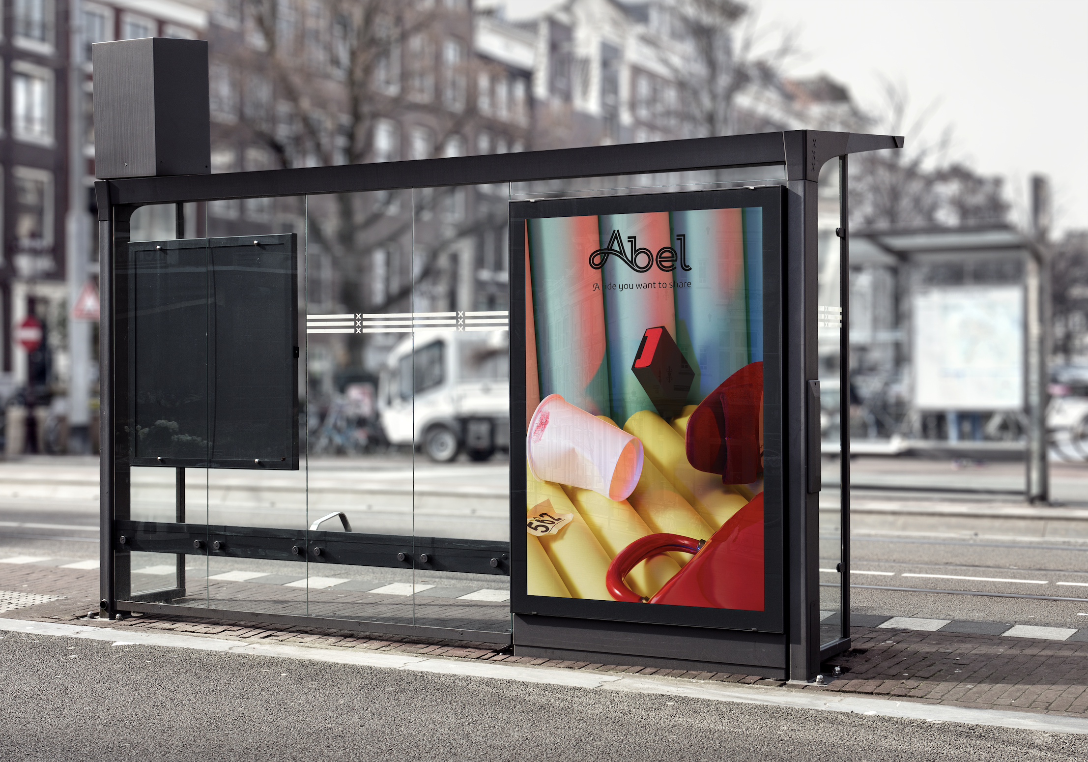
For the launch campaign we recreated memorable moments in the taxi that celebrate Abel’s friendly sharing is caring attitude. The campaign stretched from online content to offline abri’s and billboards.
-
We created Abel’s social strategy & developed its content by producing hyper-local content with topics, brands & ambassadors that embody Abel’s local roots.
POSITIONING
Connexxion’s new taxi service was built to compete for the Dutch roads with global giant: Uber. By tapping in on local sentiment rather than international allure we created a distinguishing market position, using its cultural heritage to our advantage.
Choosing to stay local provided Abel with the unique opportunity to really tune into their audience. Whether that’s online, on the street or at the local carpool. Resulting in highly focused and specific messages that resonated with our local customers when compared to Uber’s one-size-fits all approach.
VISUAL
IDENTITY
By bringing ‘Abel’ to life, we choose to engage purposefully with our community and gain an advance on market leader Uber with a hyper local character & a melancholic look that winks to classic Dutch stories.
LOGO DESIGNAbel’s logo was designed to resemble the Dutch roads.
We created for a flowing font that embodied the smoothness of Abel’s mobile application and your ride.
For the bodyfont we choose a curly font that brings the fairytale background to the front.
CAMPAIGN
For the launch campaign we recreated memorable moments in the taxi that celebrate Abel’s friendly sharing is caring attitude. The campaign stretched from online content to offline abri’s and billboards.


PHOTOGRAPHY
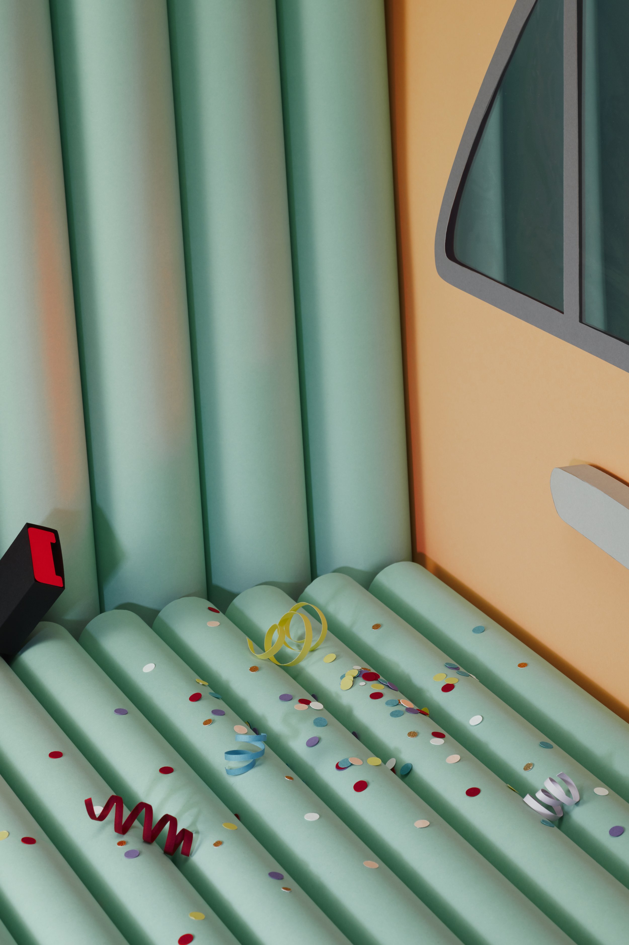
— Childrens book inspired images combined with stories from Amsterdam street culture


